Sayurbox | 2024-2025 | Full-time
Homepage Revamp: +2% ATC, +7% Orders, and +34% M1 Retention with Min Development Effort
About the Project: Homepage Revamp 🎨
A data-driven homepage redesign combining Endless Scroll and a Deep Hook Banner: improving product visibility, price perception, and engagement while delivering measurable business impact with minimal engineering effort.
My Role
Senior designer, with cross-team collaboration.
Sayurbox Team
1 PM, 1 Researcher, 2 FE, 2 BE, 1 VP product, Business & Marketing (category managers, creatives, content).
Methods
Benchmarking, IA, Wireframe, Hi-Fi & Weekly Sync via Design Critique, Usability Testing, A/B Test
Tools
Figma, Figjam.
Design Timeline
2+ months.
About the Company: Sayurbox 🥕
Indonesia's leading farm to table e-grocery, serving 1M customers with 5K+ SKUs from 10K+ farmers. Design is a core growth driver that drive clarity and conversion.
Background
Sayurbox is Indonesia's leading farm-to-table e-grocery, serving 1M+ customers with 5,000+ SKUs sourced from 10,000+ local farmers. Design sits at the core of growth: directly influencing discovery, conversion, and retention.
It's core users are semi-planned buyers: they come with a category in mind (vegetables, fruit, eggs) but decide on specific products in the moment. For this behavior, the homepage isn't just an entry point, it is the primary decision-making surface.
Problem
Despite high traffic, the homepage was underperforming as a conversion driver. Scroll tracking and behavioral data revealed a clear pattern: most users dropped off before reaching the 6th section, and the majority of conversions happened within the first 10 seconds of a session.
Digging deeper, three root causes showed up:
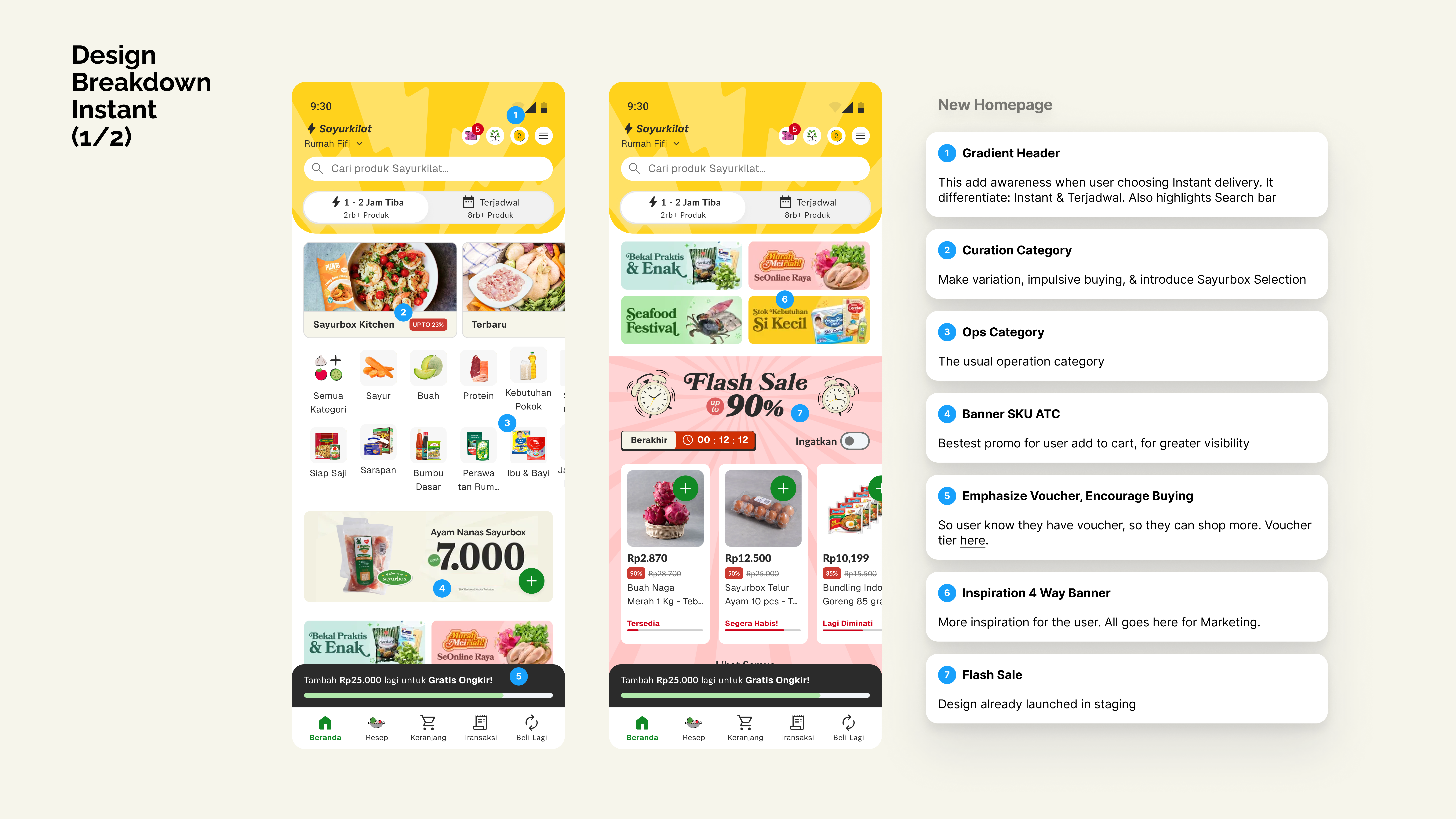
1. Overcrowded layout killed discoverability 80% of homepage space was occupied by static promotional banners. Key products and relevant promos were buried: users had to work to find what mattered, and most didn't bother.
2. No clear value signals weakened price perception: Pricing lacked contextual framing. Users couldn't quickly knows whether they were getting a good deal, creating hesitation at the point of decision.
3. The highest-intent moment was left undesigned The first 10 seconds of a session carry the strongest purchase intent, yet the top of the page was treated as a branding zone, not a conversion zone. That window was wasted.
Business goal: Reposition the homepage as both a discovery engine and a conversion driver. Improving discoverability, price perception, and retention with minimal engineering effort.
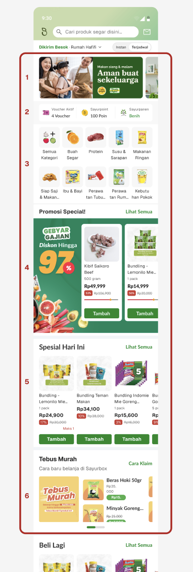
💡 Based on data, most interactions drop after the 6th section. (This is the old design)
Solution
Two phased of work, each targeting a different behavioral problem:
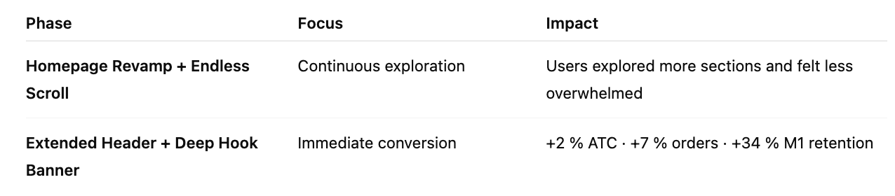
Phase 1 — Endless Scroll + Homepage Restructure.
Goal: fix the foundation. Make exploration effortless.
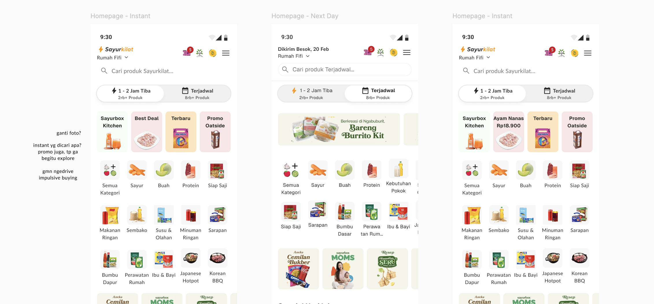
💡 One of many homepage explorations
The first phase addressed the structural problem. Rather than a full redesign, I focused on high-impact changes:
- Reduced banner clutter by 60%, focusing on essential categories and relevant promotions.
- Introduced Endless Scroll allowing users to browse continuously without cognitive breaks.
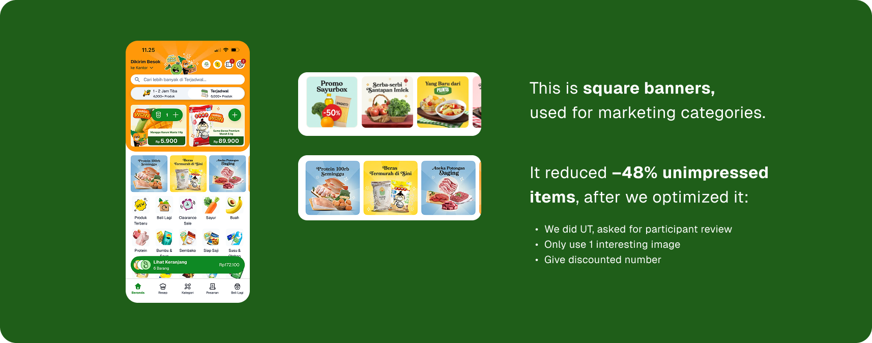
- Repurposed square banners for marketing categories, so they felt more integrated and useful.
- Standardized spacing, type hierarchy, and pricing layout to build consistency and reliability.
- Enhanced price communication through compact cards (“Sayur Buah di Bawah 20ribu”).
The Results:
- Users browsed deeper into the homepage rather than leaving after the first few sections ✅
- Scroll recordings showed smoother navigation and fewer sudden stops ✅
- Higher visibility for seasonal and promotional categories ✅
- In user feedback sessions, participants described the new homepage as “cleaner,” “inspiring,” and “easier to explore” ✅
Phase 1 turned random browsing into a guided experience.
The homepage now encouraged inspirations:
💡 Homepage revamp release before creating Deep Hook Banner
💡 Homepage Endless Scroll
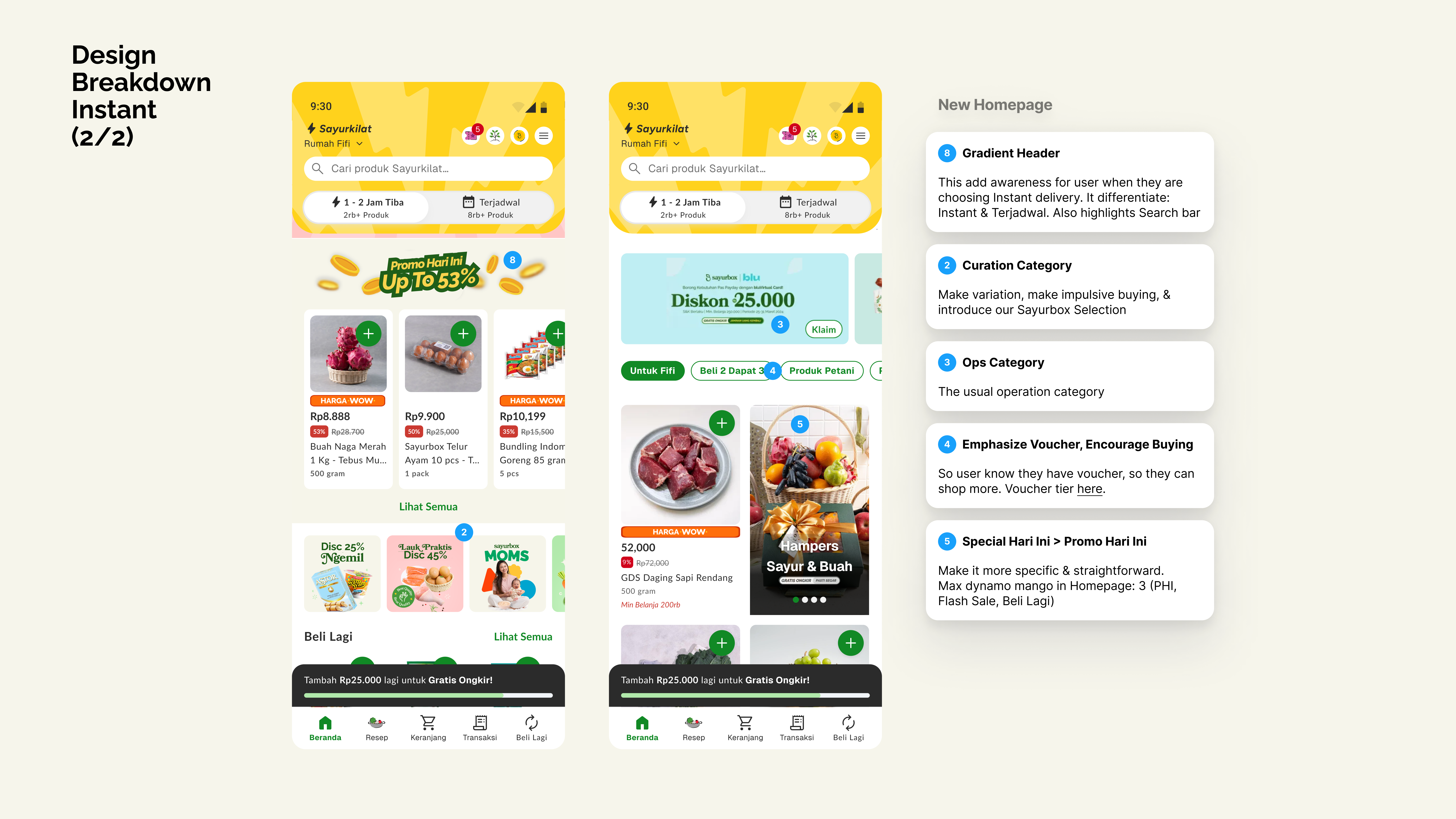
Phase 2 — Longer Header + Deep Hook Banner.
Goal: capitalize on the first 10 seconds.
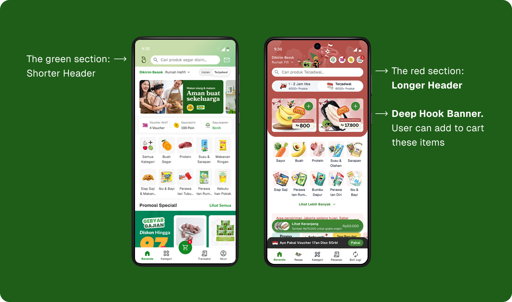
After Phase 1 shipped, data confirmed the behavioral insight: the first arrival 10 seconds moment was the highest-leverage point on the page. So we did:
- Extended the header area to create a stronger focal entry zone, balancing storytelling (SKU + promo) and direct conversion. It provided breathing space for key promotions and helped frame the first scroll.
- Within this new header, we embedded a Deep Hook Banner inside: two high-value SKUs with prices and direct Add to Cart buttons.
It reused existing product-card components, keeping engineering work minimal. - Value communication pairing with concise copy and discount labels.
- Balanced attention and trust: the header felt editorial, not pushy. Guiding users without overwhelm.
The Results:
- Users engaging immediately with the 2 featured items instead of scrolling past the hero section ✅
- Early-session conversions increased, validating the first-view carried the highest purchase intent ✅
- Marketing teams adopted the banner pattern for bi-weekly offers because it required no new development ✅
- Combined with contextual checkout vouchers, this change helped deliver the +34 % M1 retention (ATH) reported earlier ✅
The combination of an Extended Header and Deep Hook Banner achieved results with minimal engineering: a precise, low-effort improvement that maximized business impact.
Homepage Revamp: Give User Ways to Explore.
Deep Hook Banner : Give User an Action to Convert.
The homepage redesign made exploration effortless, while the focused header innovation turned that engagement into action.
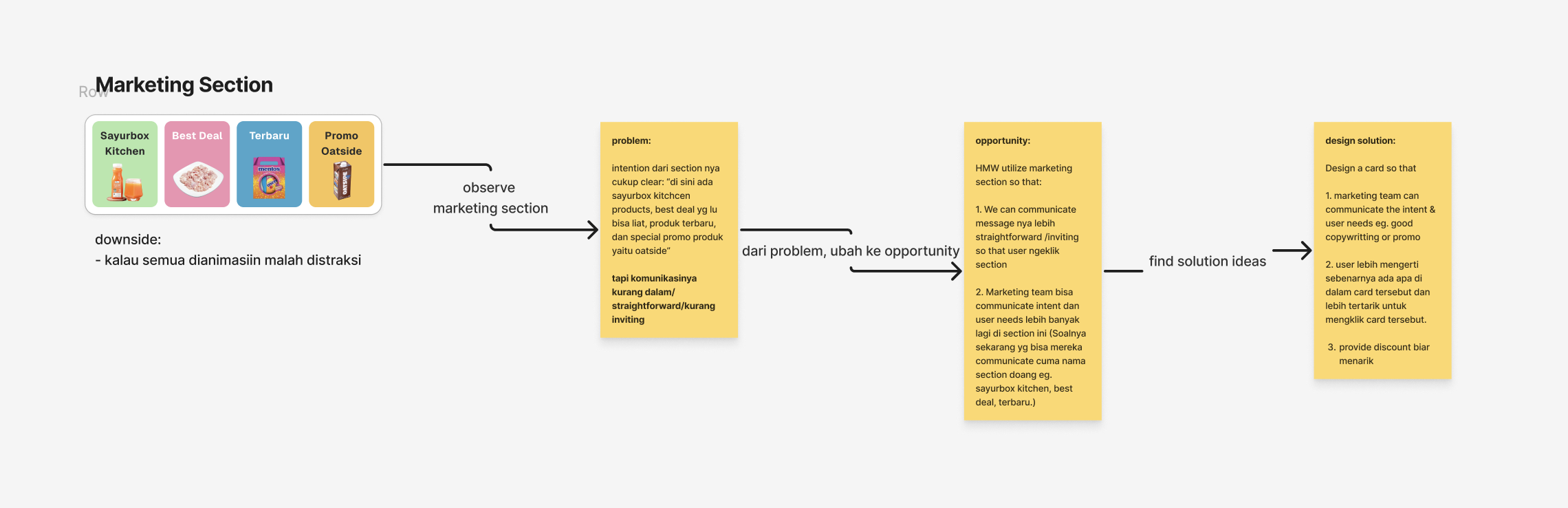
💡 A hypothesis breakdown of user perspection towards marketing section
Design Process
Collaboration: Worked closely with PM, VP Product and analytics to ensure business return.
⭐️ Research & Analysis
- Gather context, stakeholder insights
- Behavioral insight: scroll tracking revealed engagement drop-off zones (user drop-off after 6 section).
- CTR analysis. - See previous user interviews
To understand perception of price vs value. - Information architecture, competitve analysis
Benchmarking grocery and retail apps.
⭐️ Design
- Wireframe, hi-fi design, copywriting
Wireframes → prototype testing with returning and new users. - Design critique with stakeholders
Weekly design critiques with designers and stakeholders to absorb feedback & new perspectives. Stakeholders can suggest better input. - Prototype for UT
Explored header proportions and banner placement through A/B options.
⭐️ Testing & Validation
- Usability Testing (UT) and design revision
UT homepage endless scroll by UX researcher. - Homepage guideline (for marketing)
Making sure the marketing team align with each section purpose and sizing.
![[New Homepage] Prototype for UT](https://pixiepasa.work/wp-content/uploads/2025/10/New-Homepage-Prototype-for-UT.png)
💡 Usability Testing flow for homepage revamp
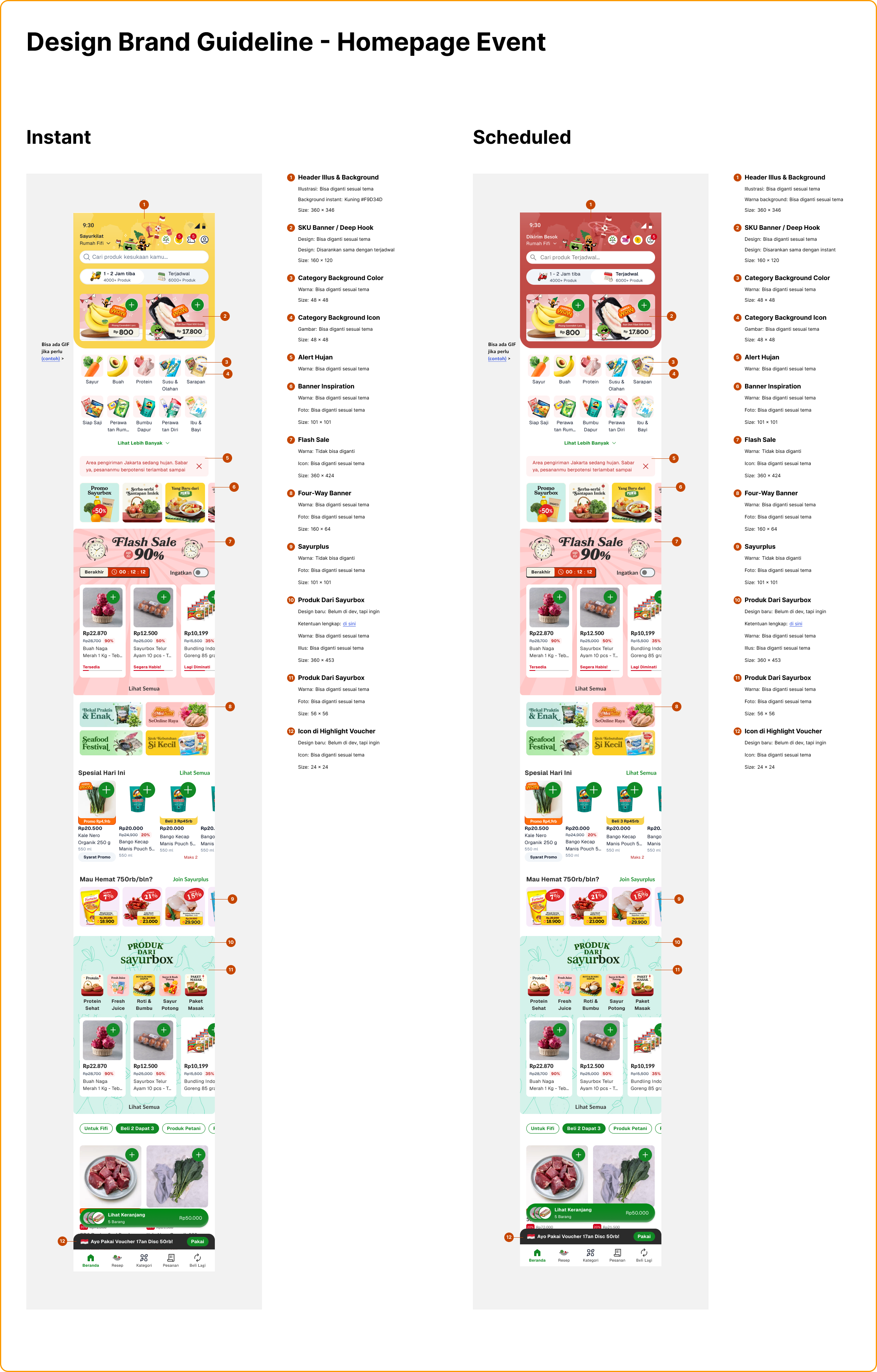
💡 Homepage guideline for marketing team
Impacts
KPI
Add-to-Cart Rate
Total Monthly Orders (Improved price perception)
Unimpressed Items
M1 Retention
Price Perception
Outcome
+2% (By improving visibility of promoted items)
+7% (Supported by clearer product hierarchy and pricing)
-48% (After optimizing square banners for marketing categories)
+34% (All-Time High. Combining Deep Hook Banner w/ targeted checkout vouchers)
Improved through stronger item visibility and value communication
Price perception on Telur Ayam (Eggs) that placed on Deep Hook Banner or SHI Section, shows strong value perception:
Despite being priced 45% higher than the cheapest online competitor, Telur Ayam consistently drives high Basket ATC (18.8%), growing +2.9% vs the 4-week average. This indicates customers trust our quality and are willing to pay a premium.
By helping users see, decide, and act faster, we improved both short-term conversion and long-term retention. The new header design and Deep Hook Banner turned the first 10 seconds of browsing into the most valuable part of the session:
BEFORE -> AFTER DESIGN
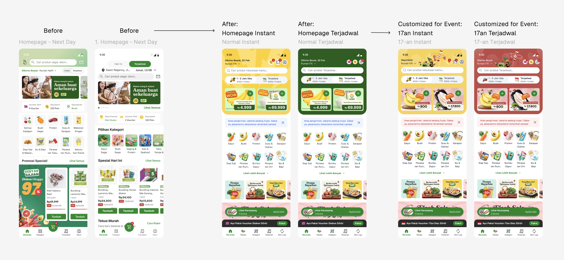
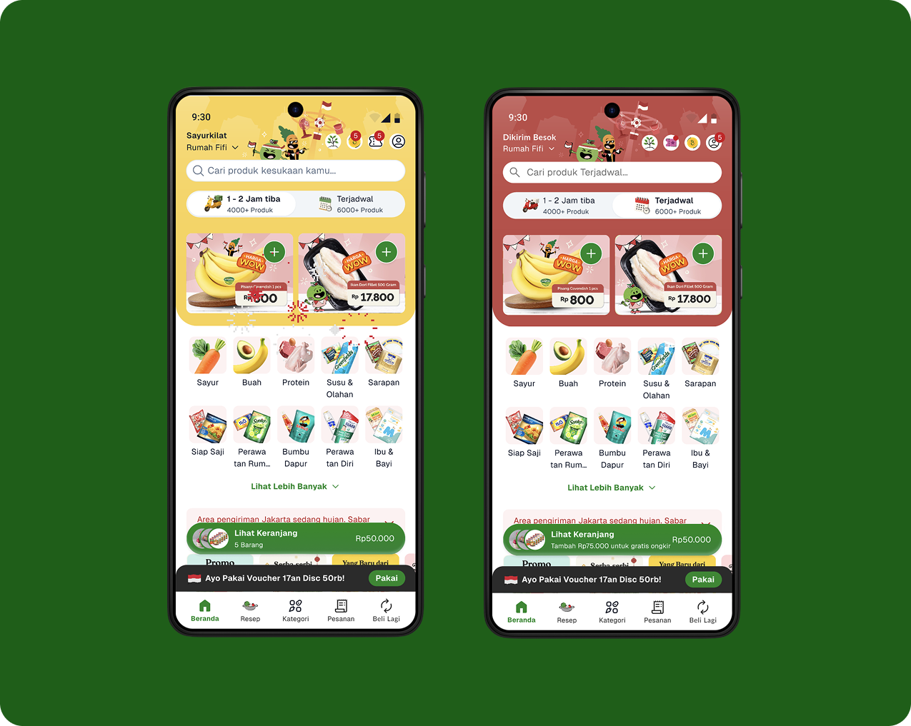
💡 In centered is homepage when normal state: instant and terjadwal — To the right is when there's event going on this month.
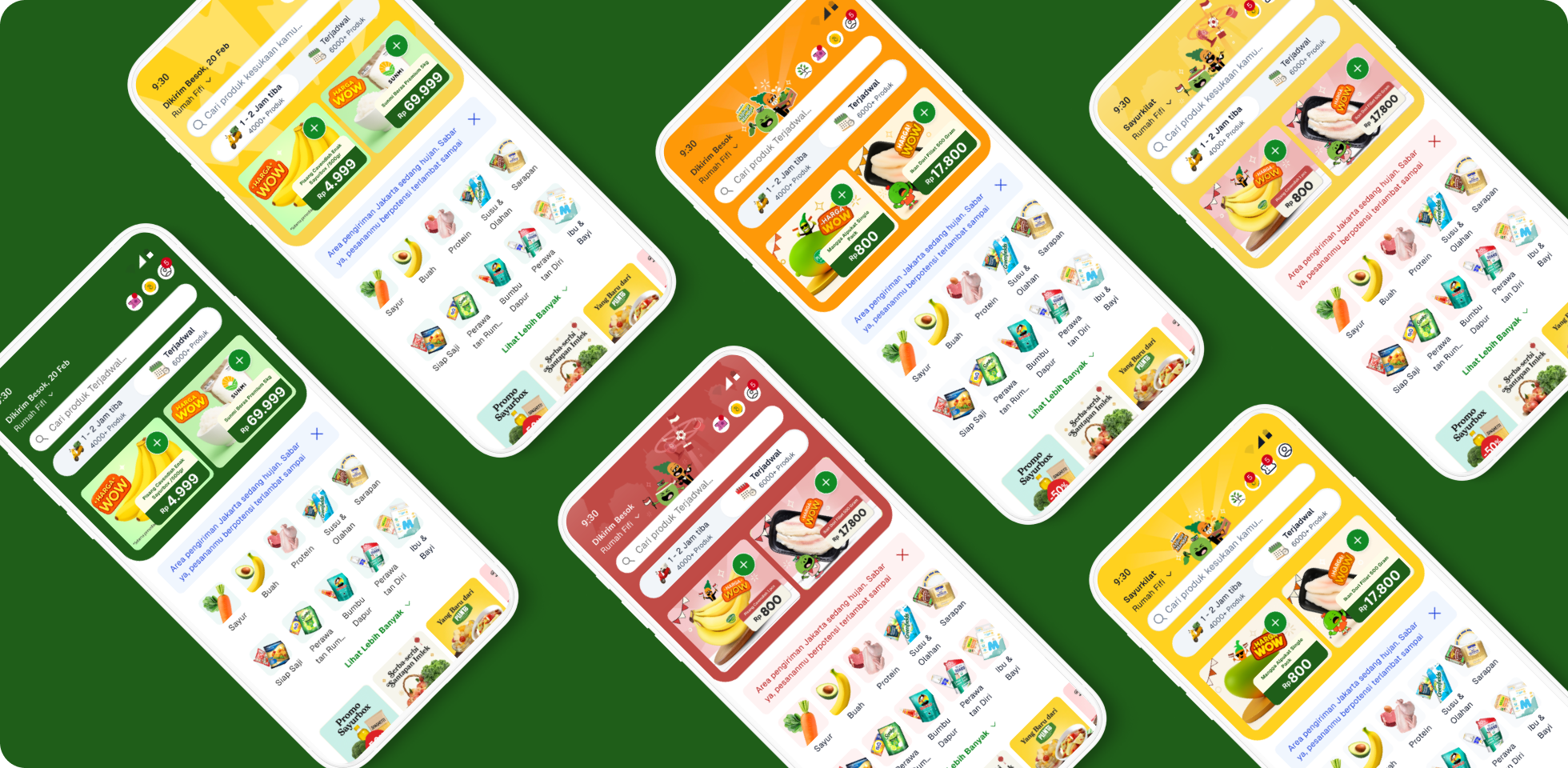
💡 Deep Hook Banner, with different events: normal state, independence day, and mangoes month
Reflection
This project reflects something I keep coming back to:
Impactful design isn’t about doing more — it’s about doing what matters most.
By focusing on two small but high-leverage changes (Endless Scroll and the Deep Hook Banner), we were able to move key business metrics without heavy engineering work. Thoughtful design can boost user trust and engagement while keeping development simple.
Ultimately, the redesign turned Sayurbox’s homepage from a static promotion board into a dynamic space for discovery and action, benefiting both users and the business.
The result: +2% Add-to-Cart rate, +7% monthly orders that improved price perception, -48% of unimpressed items, and +34% All-time high M1 Retention.
Robertha Dayu 〰️ 2025
Product Designer
Contacts
e. roberthadayupasa@gmail.com
linked in